Learn to look not just with your eyes but with your heart. Find the things that connect with you. Then you will know how to design your home? Kelly Hoppen | Designer
The Doll house
I don’t remember having a favorite doll. What I do remember is the tin dollhouse. Two-story, traditional. Two bedrooms, one bath up, living room, dining room, and kitchen down. I loved my little tin house. I would continually rearrange the furniture. I would cut little strips of fabric for the window curtains and make matching bedspreads. My mother would crochet tiny little rugs for the bedrooms. It was such a happy home, my little tin house sitting on an old coffee table under my bedroom window.
One through Five
Today, we are going to expand our vision from the dollhouse to the real thing! These five, fun, very easy steps will encourage you to explore new ways of looking at all your treasures. And how to rethink the way you approach a new purchase. We are going to concentrate on your accessories at this stage. Accessories are the jewelry of the room. When we’re finished, you will not only have a beautiful fresh look, but you will have the tools, and confidence to create other moments throughout your home. You will also begin to develop a sense | a good eye to see what is missing. Underrated, this phrase – ‘what’s missing!’ It has ruled my approach to life, design, and careers. Which is saying a lot for a gal who believes that the glass was created half full. When you feel an element of your design is missing, do not panic. You can rethink your fresh look, or you can stand by it. You’ll take a photo, and in your travels – you’ll find the perfect piece!

Step One – Finding your Design Style
Step One | First things first | What’s your favorite room? Why? When a guest walks into your home, what things best describe you? Can they tell immediately that this is your spot this is YOU? Finding our style identity is easier then you think. A good place to begin is with Pinterest. Look for room-specific boards from a pinner you admire. Start your own room-specific boards. This will help you focus and organize your likes. And sooner then you think, you’ll begin to notice a trend – a style. It’s called a red thread, Roda Traden. It’s a Scandinavian expression that describes the essence, a consistency that is visual. All the pieces in the room harmonize. When a room is in harmony, you know it instantly. You and your guest feel comfortable, at home! NOW…decide what surface needs a fresh look. Maybe it’s your coffee table, the console in the entrance, a bookcase. Keeping your fresh look selection in mind let’s head over to step two.
Step Two – Think outside the room
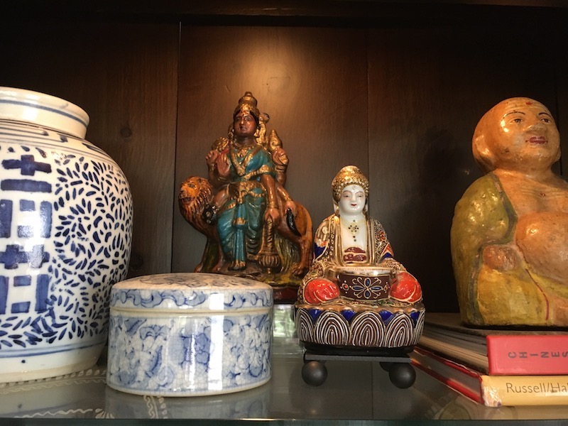
Step Two | Take a hike! Around your home. Pretend it’s a walk through the beautiful displays in your favorite boutique home store. With this mindset, you will be amazed at all the items you are going to be reacquainted with. When a piece stops you, I want you to look at it with a fresh eye. By that I mean – are you emotionally connected to it – As Marie Kondo would ask, does it spark joy? Another point to keep in mind; just because the item is your bedside lamp, it doesn’t mean it can’t go on that neglected console in the entrance. This is the key. Think outside the room! Be prepared with little sticky joy dots or post-its. I want you to trust your instincts. Remember we’re primarily searching out accessories. Keep two things in mind…Think of this as you would when selecting accessories for an outfit. In this case, you’re dressing a surface! Select items not only on their design merit but also, does it follow the red thread concept. This is a fun step. Take your in-house hike with a glass of wine, your favorite playlist keeping rhythm while you explore.
Step Three – Edit. Edit. Edit.
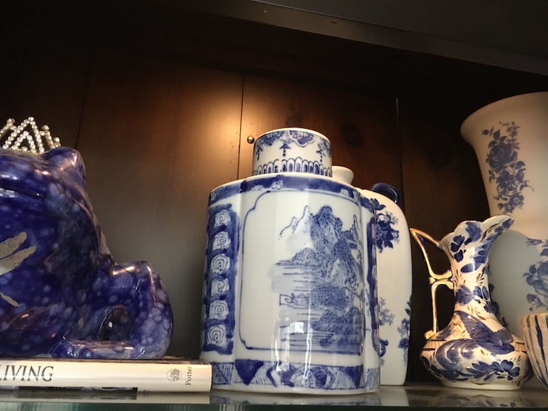
Step Three | Attention hunters and gathers please step forward with your treasures! Now, find an empty spot, the dining or kitchen table will do. You’ll want all your finds in one place. You’ve already made your fresh design selection and that’s the surface you’ll concentrate on. This is your editing stage. You’ll do it automatically because the pieces that don’t work will stand out, and you’ll remove them. And the pieces that do spark joy will be demanding your attention. The edited selections might be too much for one surface. But, hey, at this point you might be thinking the whole room needs a new look! You know more then you think you do. I bet you have loads of design ideas. All of these images are stored inside you – open that door. You do not have to move quickly in this step. You’ll probably edit and re-edit. Your ideas will begin to take shape. And, before you know it you’ll start to form your vision for your fresh look.
Step Four – Story Time
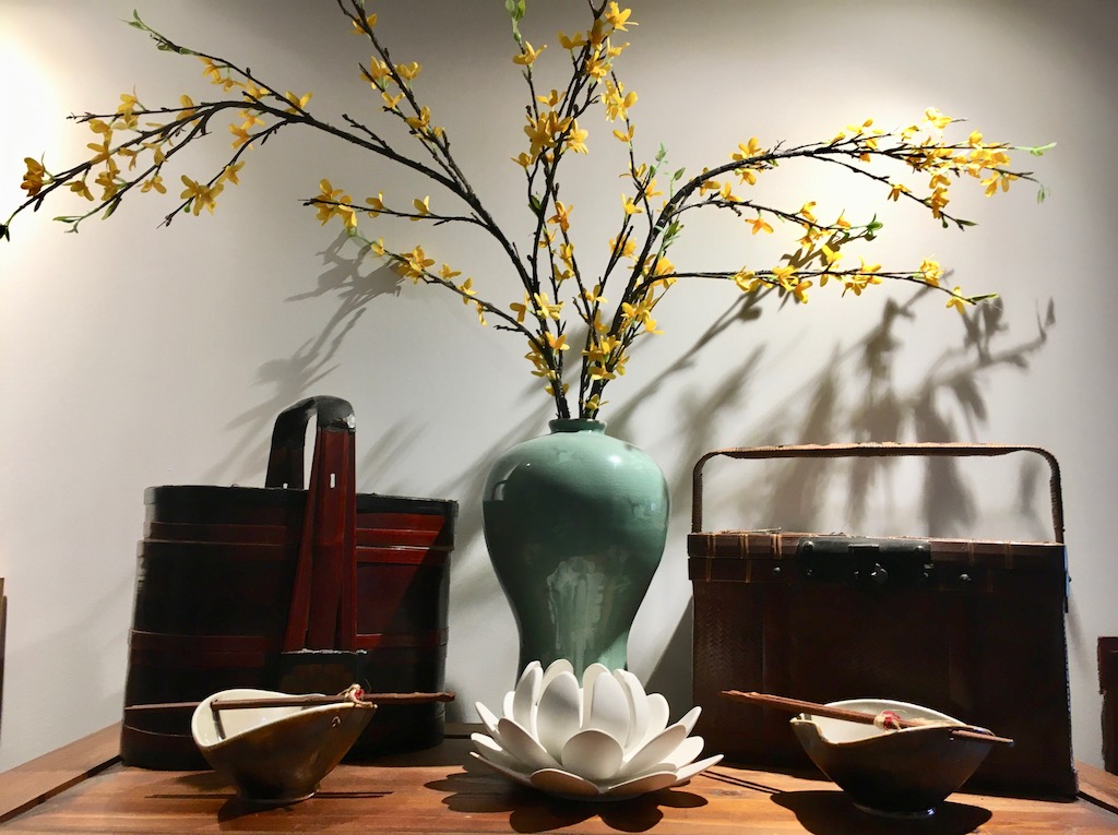
Step Four | Once upon a time a beautiful gal found her true love style! And that gal is YOU. You have completed your editing, now starts the real fun. First…what surface did you select in step three? With that decision made and your edited pieces ready to go, you can get started. There are a few different ways you can create your fresh look direction. First… Do you want to tell a story? Then start with those treasures from travels and vacations. How about favorites. Those special momentoes that we all have and love. An off-shoot of the story is the theme direction. You’ll have a lot more wiggle room in this direction. The theme has a wide range of possibilities. But, it has to harmonize; remember the red thread concept. Creating around a theme is my favorite. It’s a fundamental element of merchandising, design, and styling. A few examples. Vintage silver. Coastal/Seashore. Asian. Ceramics. Eclectic. Let’s say you select the coffee table. Gather the items from your editing and you’ll be ready to approch your work surface.

Step Five – The ABC’s of Styling
Okay, all you gorgeous stylist, let’s make a move on that coffee table! This is the nuts and bolts step. You want to be prepared with a few standards of display styling. The shape and size of your table is also going to determine your fresh look. Some items work better on rectangle then roound.
- Look High and Low…If all your items are at eye level nothing gets noticed. You want to have an assortment of heights. For height go for a stack [4-5] of books, spine in. Three candlesticks in varying heights. I like it when they don’t match but harmonize. Layer in lower items. A vase, a glass sculpture.
- Serve it Up…Trays and boxes are your BFF throughout the house. I have nine trays scattered around our apartment. The beauty is that both corral smaller items, which left on their own can look cluttered. The tray offers you another display surface. In the box, the remote, your glasses, a lighter for candles.
- What’s your Angle…Think about how your fresh look will be viewed from different angles in your room. Items that have a plain or functional back will not work.
- Keep it Personal…Just imagine, your table is finished. It looks fab and a friend comes over and asks you about a piece on the table. All of a sudden it’s Story Time. The reward for your effort.
- Pick a Side…Choose to style just one side of your table. It will look less cluttered. Make it bold with varying heights. Add an orchid. This is especially attractive on a glass table, no matter the shape.
That’s it, girlfriend. I hope that you have found these steps helpful. Remember, the more you do it – the more you improve your eye and your confidence. Please share photos of your Fresh Look. I know we would all love to see it…
Next in the Design line up. We’ll explore an entire room in the future post – Mix it Up. We’ll touch on the psychology of design. We’ll explore textiles, mixed elements, paint colors and so much more. We’ll have fun!




2 Comments
LAURIE
July 13, 2020 at 9:07 am…very nice and inspiring article, filled with perfectly selected visuals and stimulating ideas to personalize one’s living and entertaining spaces…
Nancy
July 5, 2020 at 5:43 amThis blew me away!~ Your visuals are gorgeous..perfectly chosen to go along with your great innovative tips! I’m definitely motivated!